

Imperfect balance
Case study: Dalston terrace refurbishment

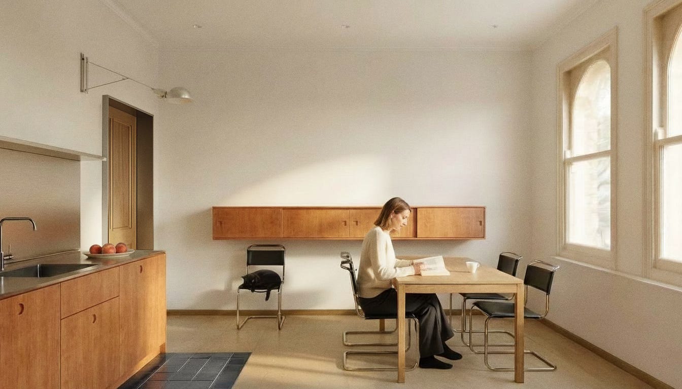
For the first time in my career, I worked on a house five minutes from where I live.
In Dalston, a neighbourhood I am so used to I barely know why I love it.
I have already written about how designing from outside in, starting with what a place is, guides my every design decision.
This project was the most direct version of that.
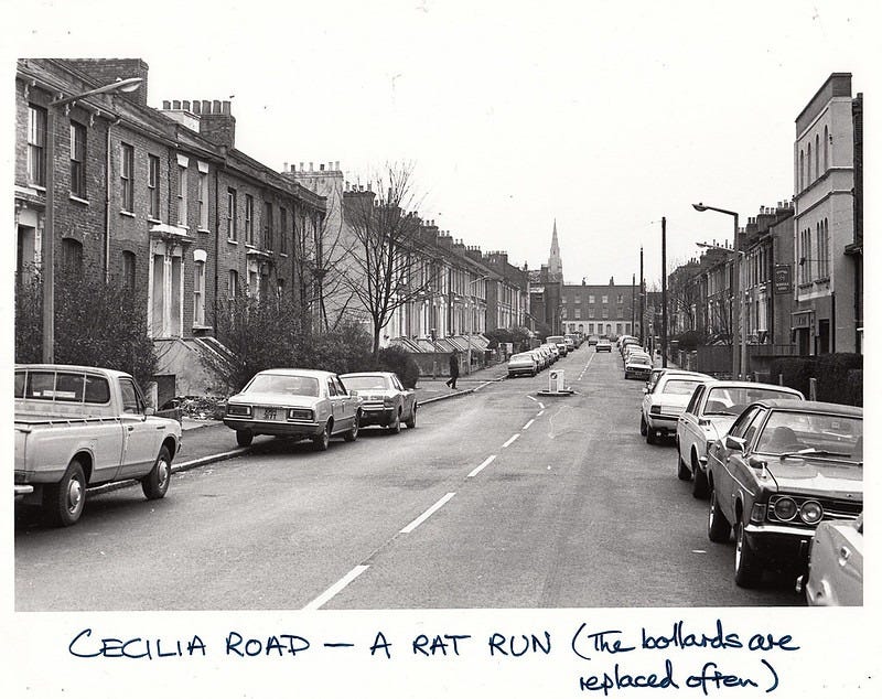
I met the client through their bike shop, two streets from my flat. The more my bike broke, the more we talked. Eventually — reluctant at first — they decided to let me work on their home.
When we first sat down, they told me what they wanted: a pristine, minimalist house. They longed for calm home that didn’t feel cluttered or overwhelming. It made sense.
What I wasn’t sure about was whether minimalism was the right approach here.
The client is warm, direct, and completely unbothered by pretension. In their home shelves are packed with books. Over time, they collected furniture, objects (and bikes).
Minimalism is a discipline that requires editing life down to almost nothing.That wasn’t who they were and I didn’t want to pretend otherwise.
Same for the house. It sits on a corner in a terrace built before 1900. Unlike most Victorian houses, it has no clear street-to-garden axis and the plan we are so used to. Inside there are levels and half levels, small stairs, turning corners. The first time I walked in, I got confused whether it was one house or multiple stitched together.
The place felt complex and needed to stay so.
A pristine minimalist interior would have flattened that complexity.. Instead, we could achieve the calm they were after without stripping everything back.
Calm, in this house, meant clarity without erasing character.
That is where the idea of imperfect balance came from.
Among the house’s previous occupants was Andrew Holligan, a photographer who spent years documenting Dalston. Looking through his book, I kept returning to one image: a wall covered in posters. A miners’ strike notice layered over a deportations protest, layered over a St Patrick’s Day flyer.
To me, that wall is the epitome of Dalston – multiple voices and identities accumulated over time, all on top of each other.
It holds contradictions and is far from pristine. Instead, it is human and unapologetic.
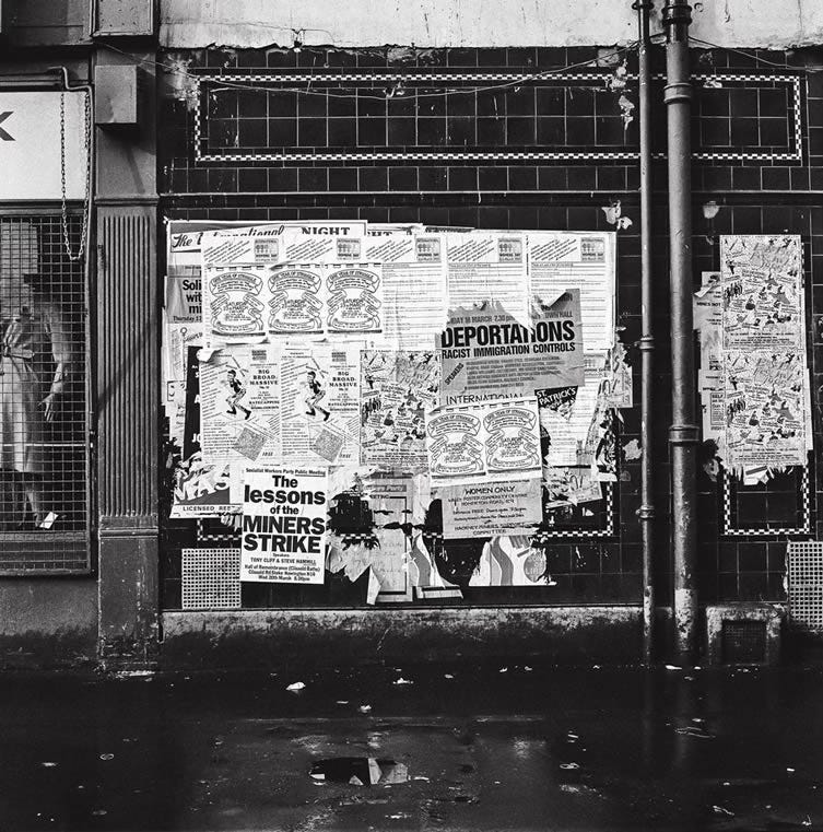
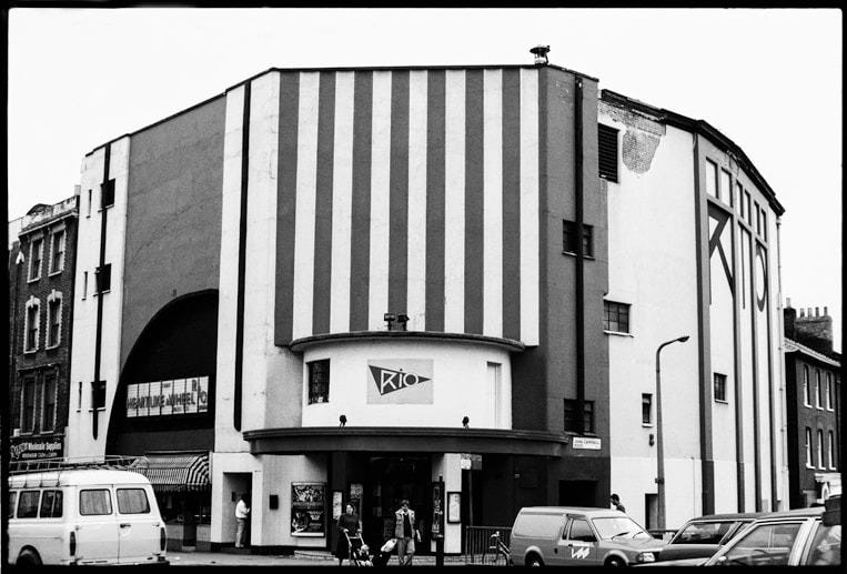
I wanted to bring that quality inside. Not the roughness, but the soul underneath it. The idea that a space can carry more than one thing at once without falling apart.
The risk is obvious – patchwork can become tacky.
How to hold contrasting materials while staying gracious? The answer is composition.
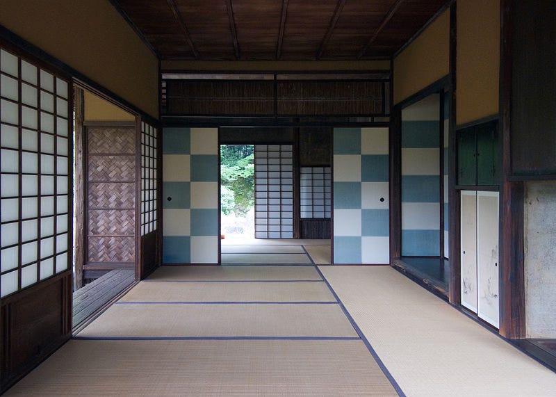
Katsura Imperial Villa is a good example of what I mean. In a single room: rough plaster beside dark timber, woven tatami beside bold painted panels, raw thresholds beside refined joinery. Many materials arrive at harmony because of how they are arranged.
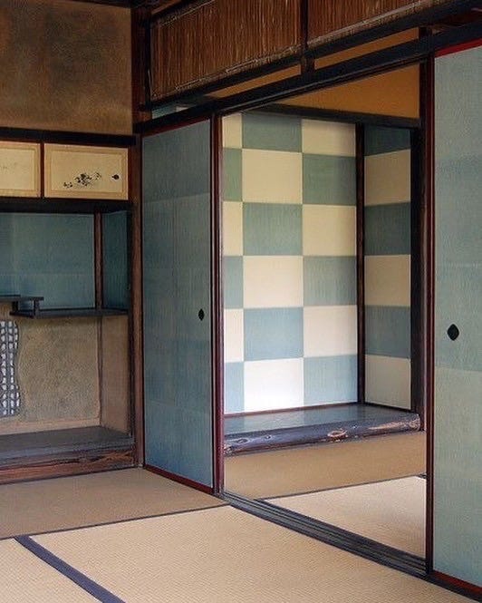
Each element seems a must-have, and the variety reads as deliberate.
My previous project in Valencia was quiet by design, this one needed to be something else entirely.
The initial scope was a kitchen and two bathrooms, the rooms that carry the most daily friction, so small decisions have a big effect.
We treated these rooms as the engine of the house: if they work effortlessly, the whole home feels calmer.
The Kitchen
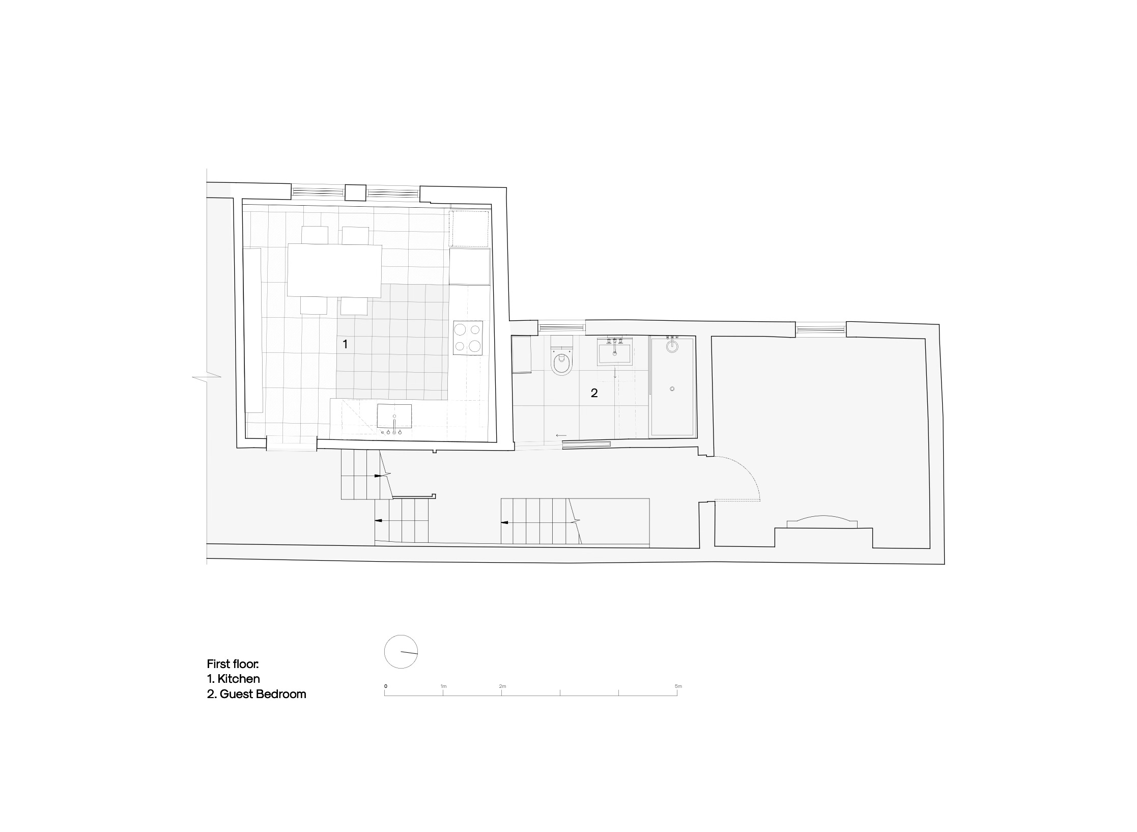
We worked with the existing logic of the house to keep disruption and cost under control.
Here, the hob stayed on the exterior wall, water connections stayed where they are. The kitchen had its own logic and we respected it.
I wanted the kitchen to feel like a room to stay in, not just a place to cook. So we split it into two zones: a working kitchen and a place to sit, each with its own floor material to mark the difference.
Before settling on anything else, we went through how they actually use the space: where things land, what gets cooked, what causes friction.
That conversation shaped every decision. The aim was materials that could handle real use while staying elegant.
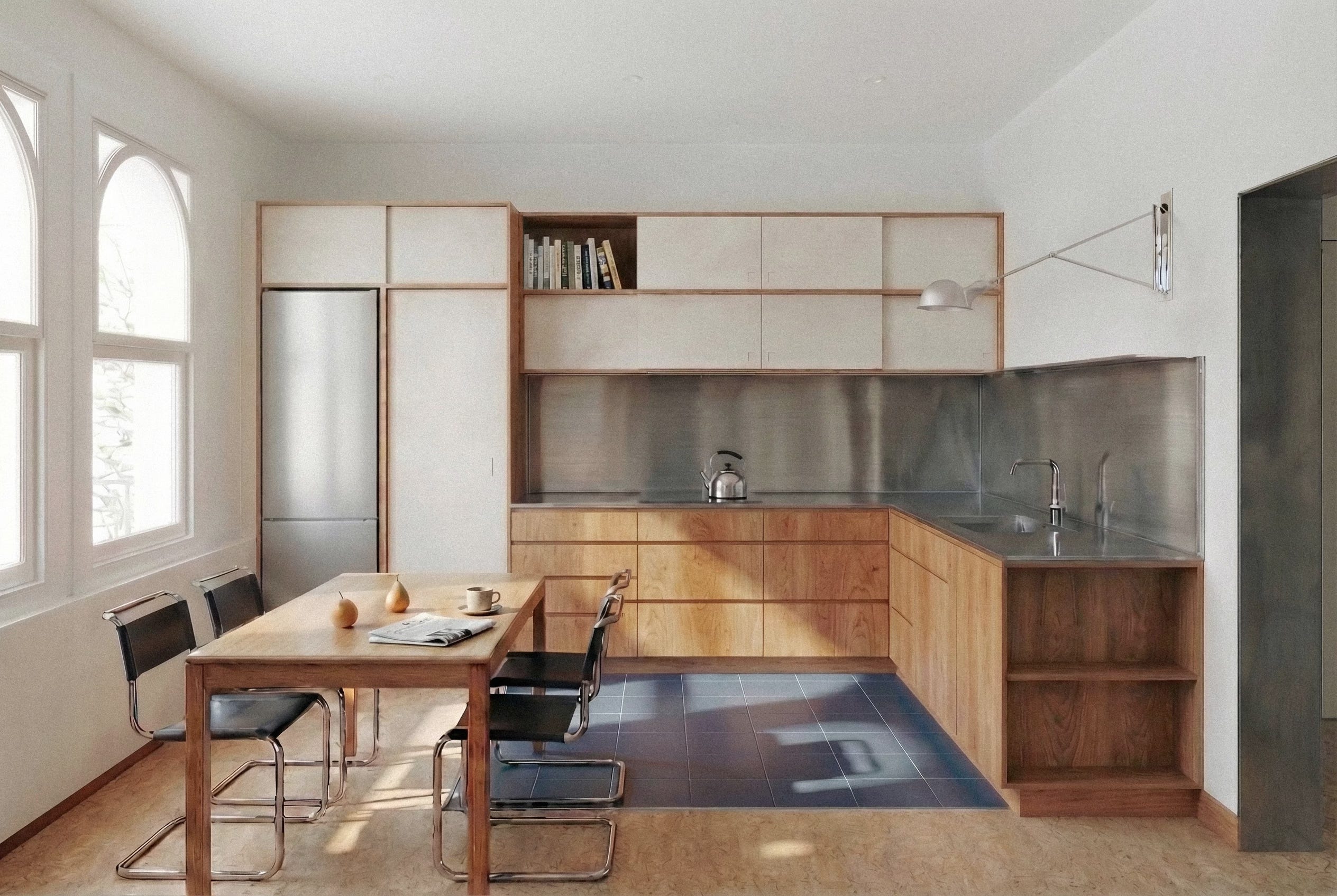
The client makes turmeric tea every morning. It stains everything. Stainless steel worktop and backsplash: elegant, practical and easy to clean. Warm timber joinery throughout, wall-hung to keep the floors clear.
The cork floor came from the same instinct. In the 1970s it was everywhere in well-designed homes, and for good reason. Soft underfoot, warm to the touch, naturally beautiful. There is something nonchalant and elegant about that era’s domestic interiors that doesn’t get enough credit today.
And then the blue tiles.
When I first showed the idea to the client they were surprised. Blue tiles? In the kitchen? But the more they looked, the more it made sense.
The blue is unexpected in the way Dalston is unexpected.
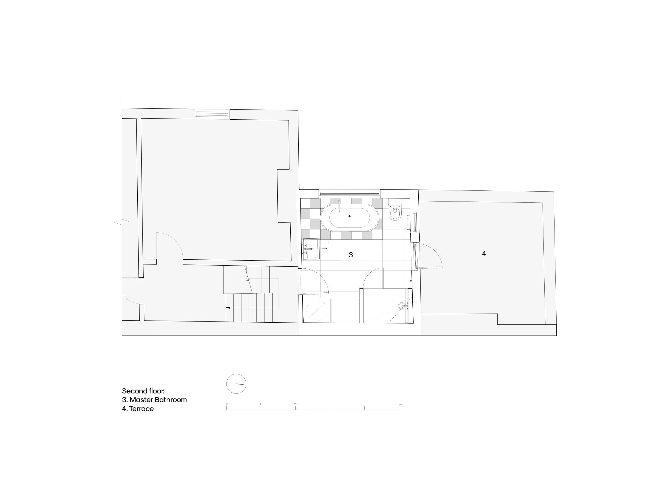
The Master Bathroom
The master bathroom needed to feel generous without tipping into cold. The space is tall and wide, which is a gift, but – given the overcast nature of London – height without warmth can feel clinical.
Warmth came from timber. It frames the shower and continues into the tall storage cabinet. The mirrors reflect the light and green from the windows.
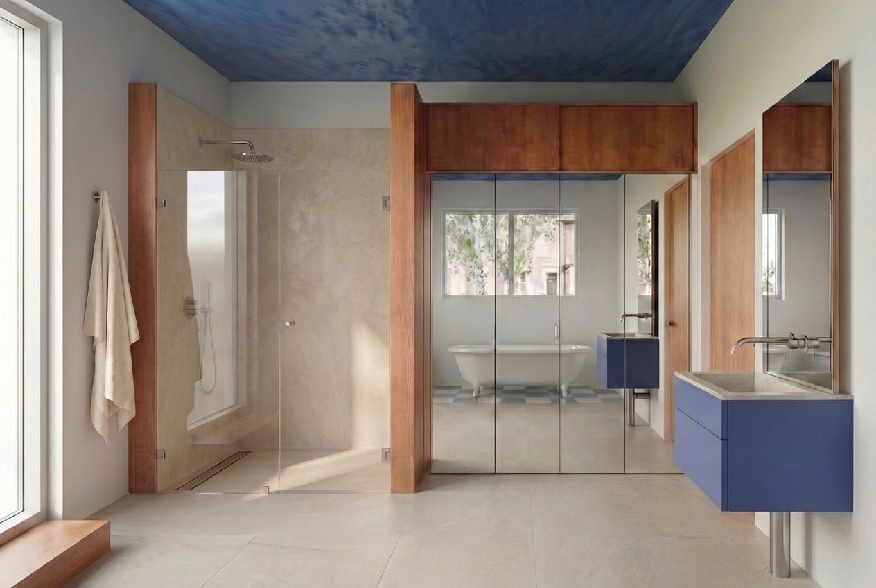
An old unused chimney breast was taking up shower space. We demolished it and replaced it with a walk-in shower. It improved the daily ritual of taking a shower with easier access, fewer awkward corners and more breathing room.
The floor beneath the bathtub is a checkerboard of blue and white. When I first drew it I thought of Katsura’s painted panels: a bold graphic element that stands out without competing.
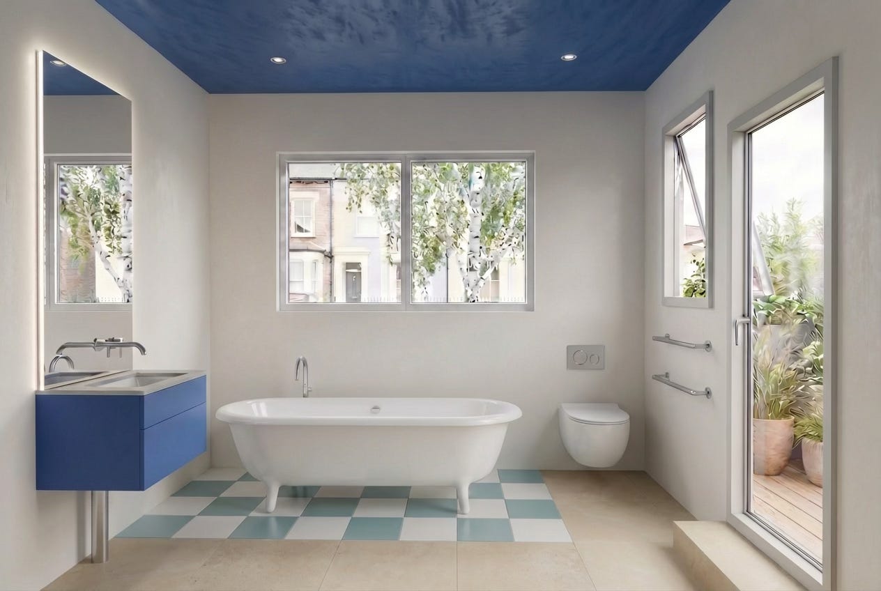
Each room in this house needed one moment of surprise. Here it was the ceiling.
I remembered Perec’s point in Life: A User’s Manual, that white ceilings are uneventful, a lost opportunity for someone to daydream in the middle of the day. In this bathroom, I imagined the client or his family learning to rest in a bathtub –something they rarely do now – and pause.
We painted the ceiling in a deep blue Venetian plaster. The kind of surface where the mind wanders looking for patterns, the way you sometimes look at the sky.
The Guest Bathroom
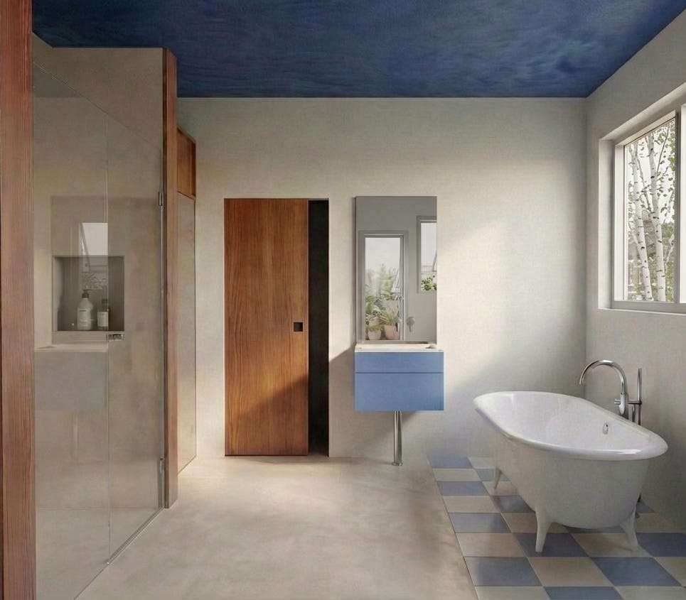
Quoting my client, the brief this room was “cheap and cheerful”. I laughed at first, but ultimately every project must have places like that.
But cost-effective design doesn’t mean bad, it means we needed to choose the few moves that enhance how the room feels.
Small rooms have two possible outcomes – they either feel cramped or they feel intimate. The difference is almost entirely about what you do with the surfaces and how you control light.
This room was tall, narrow and dark, so we painted the walls and the ceiling a warmer tone. We accentuated the bathtub with with a natural stone pattern to add depth without breaking the calm.
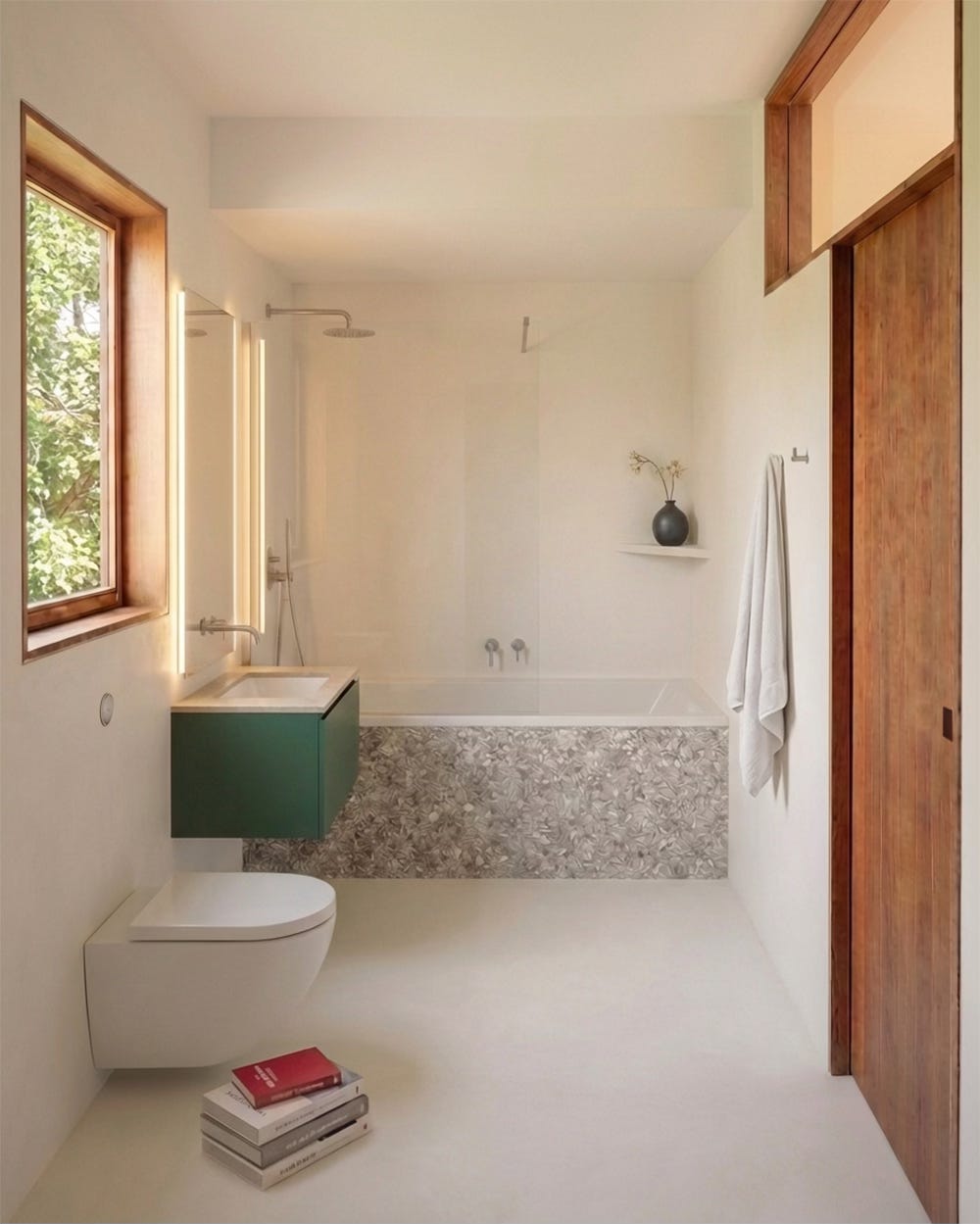
The door was the other problem. A standard hinged door in a narrow room eats into the space every time you open it. We replaced it with a sliding pocket door and added an interior window in the same cherry wood as the joinery elsewhere in the house.
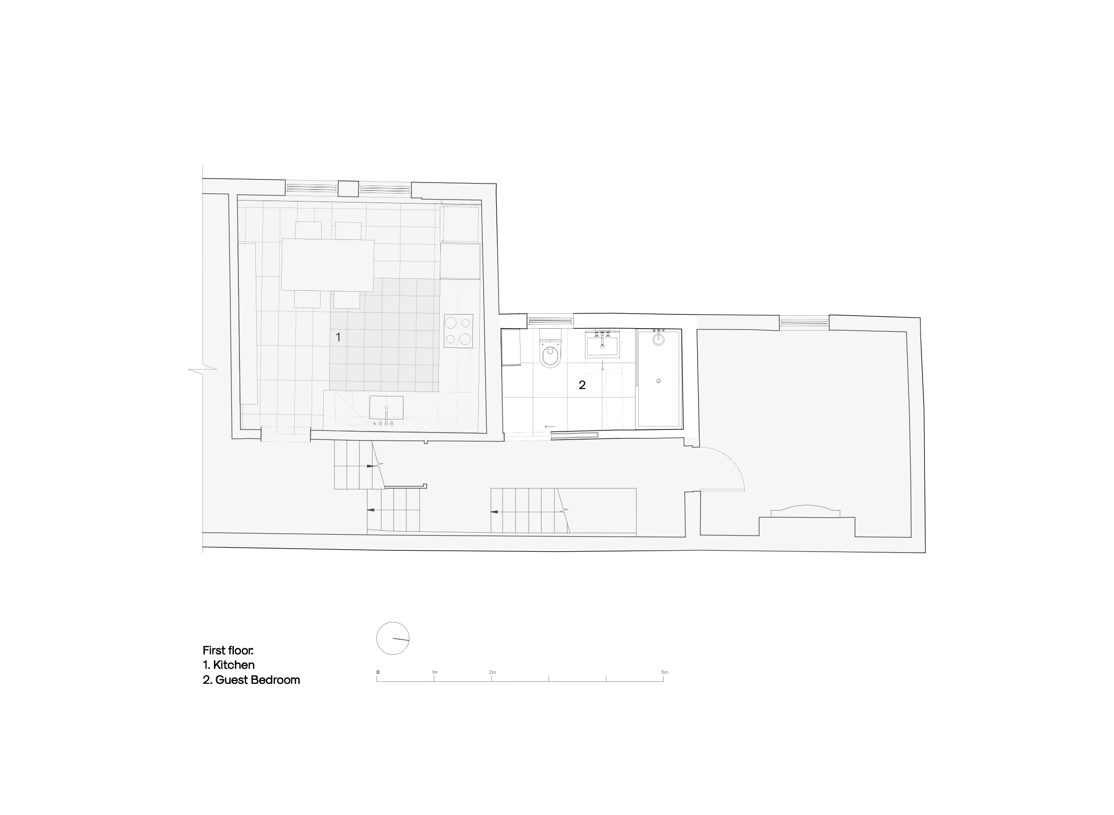
An interior window makes the room feel less closed and shared natural light with the landing without sacrificing privacy.
In small rooms, reclaiming even a few centimetres makes a surprising difference.
The room is still small, but it feels cosy now.
What’s next?
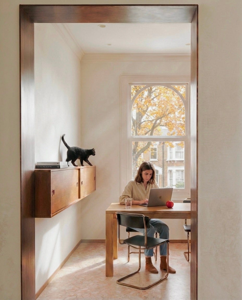
I find the coincidence curious that the project is contained to three rooms in a house. Circling back to the idea of patchwork, it only makes sense to refurbish gradually, let new thoughts arise and take things as they go.
But I find myself thinking less about what we are building and more about what comes after.
The timber will darken, the cork floor and tiles will take on the marks. At some point there will be scribbles on a wall, magnets on the fridge, books and letters stacked where they shouldn’t be.
That is the point though. We tried to make a house that does not resist life but accumulates it, carrying more voices than one.
Dalston has been doing that for over a century. It seemed right that this house should do the same.
Not every house needs to be simplified.
Sometimes calm comes from understanding the complexity that is already there, and letting materials bring it into focus.
The project is in construction now. I will share the finished photographs once the house has had time to be lived in.
Project notes:
Location: London, UK
Type: Renovation of pre-1900 Victorian house
Scope: Kitchen + master bathroom + guest bathroom
Status: Construction starting 2026
My role: Full service interior architecture: concept, drawings, specifications, tender support, procurement guidance, coordination with the contractor, and design intent oversight on site.
Outcome (design intent): A calm house without erasing character; durable, easy-care surfaces suited to daily use; clearer zoning and circulation; one deliberate “surprise” per room.
Further reading:
Andrew Holligan / Dalston in the 80s book / Life: A user’s Manual by Georges Perec /
Villa Katsura
About the Author: Polina Morova is an architect and writer based in East London.
If you enjoyed this piece, subscribe to Essential Architecture and share it with someone curious about feeling and understanding buildings.
If you’re thinking about a renovation and don’t know where to start, feel free to email me at morova.polina@gmail.com