

Designing Stillness
Apartment renovation for someone who didn’t want one.

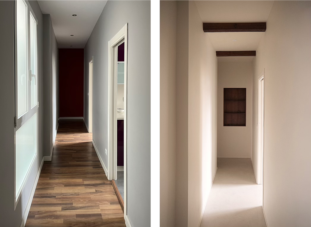
The first thing I saw when I entered the apartment was a long, narrow corridor lined with fake parquet. The walls were lilac in one room, grey in another, red in the third. The materials alone were making it feel busy.
The client had just bought the place. When we first met, they were against any changes. Everything works; why waste money?
An expat from Eastern Europe, they had just moved to Valencia and didn’t feel connected to the city yet, worried about never belonging. It was understandable why they wouldn’t want to invest in that place.
The Constraint
How can we make it feel like home?
I asked them about their happy place. Somewhere, they felt truly at peace.
Surprised by the questions and after thinking a while, they said: “I remember last year I went to see Musée de l’Orangerie in Paris, and there were only a handful of people. It was quiet”.
They described the encapsulating sense of stillness that lets you focus on the beauty of the art without distraction.
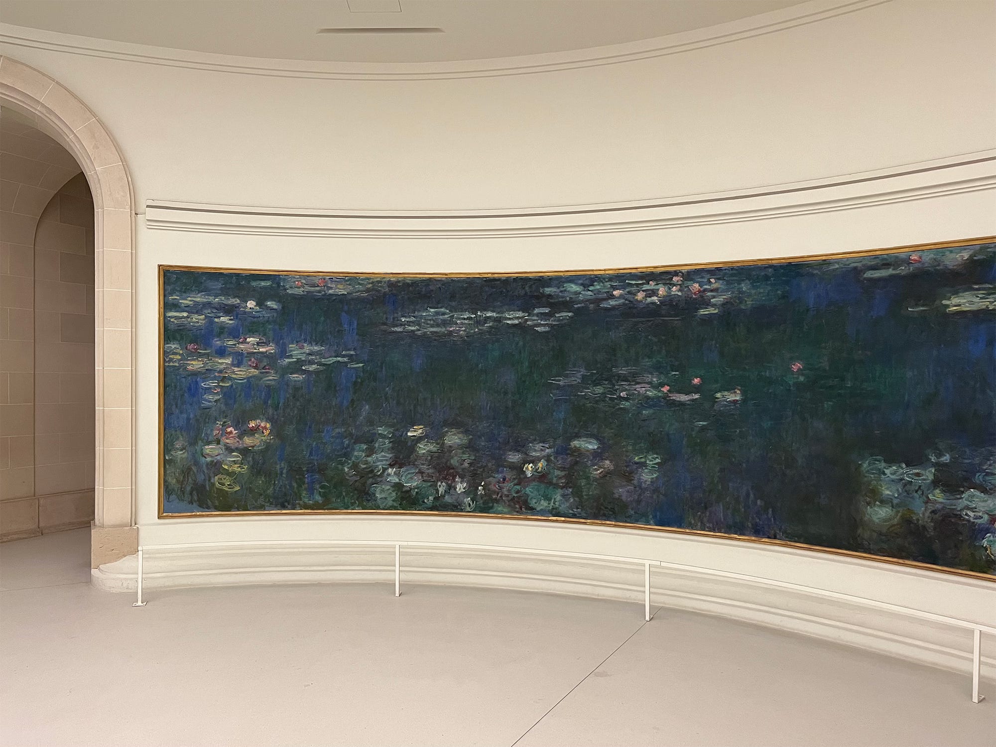
Without realising, they longed for a space that didn’t demand attention and instead offered a respite, somewhere to settle and exhale.
We agreed to work together. They were worried about the cost at first. Most people are.
So, we focused on a small number of changes that would be felt every day.
The Strategy
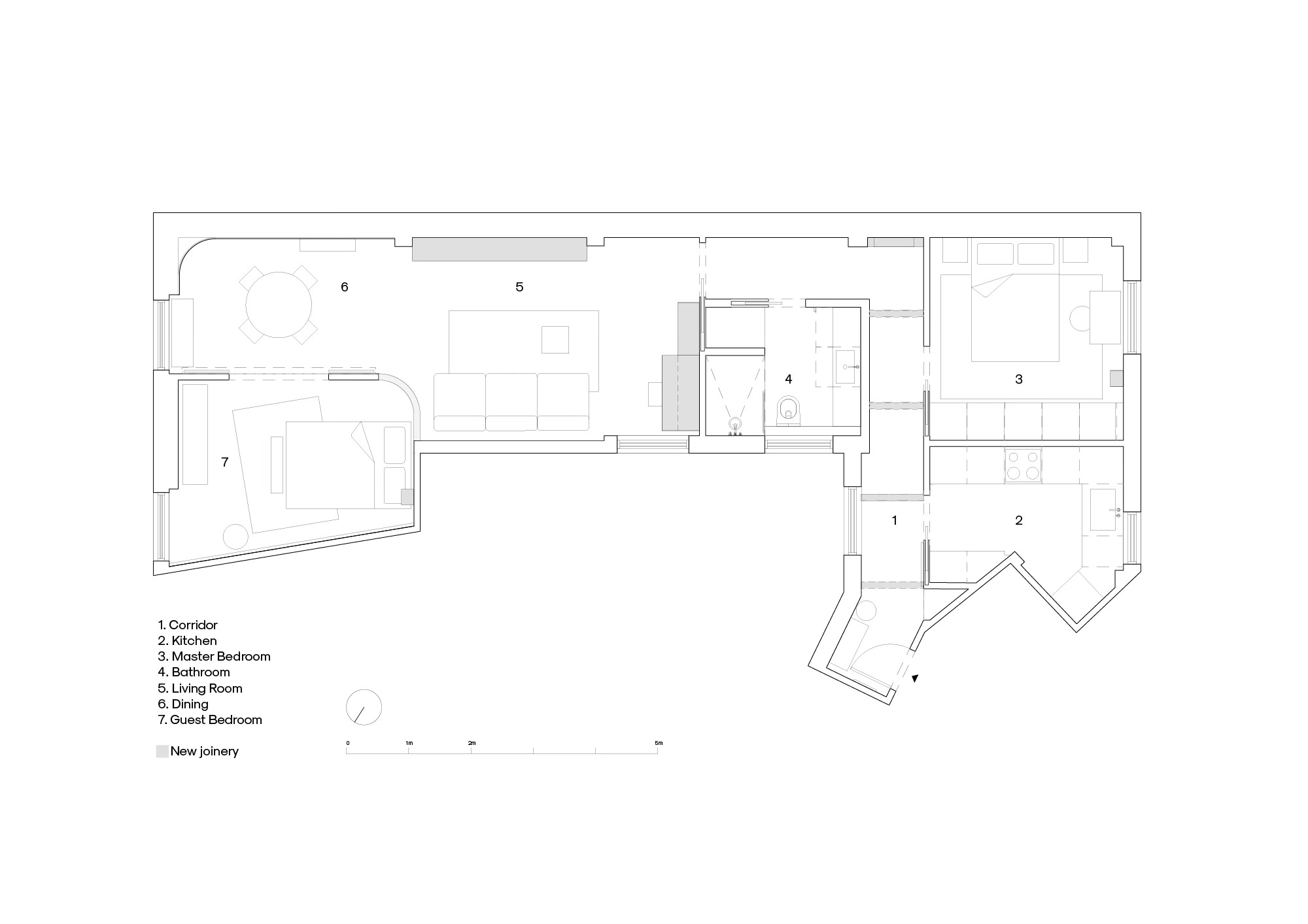
Design starts with the plan. The current layout here was odd, outdated for an open-plan obsessed design trend. Most of my architect friends suggested opening it up, knocking down walls to create better flow. But it didn’t feel right.
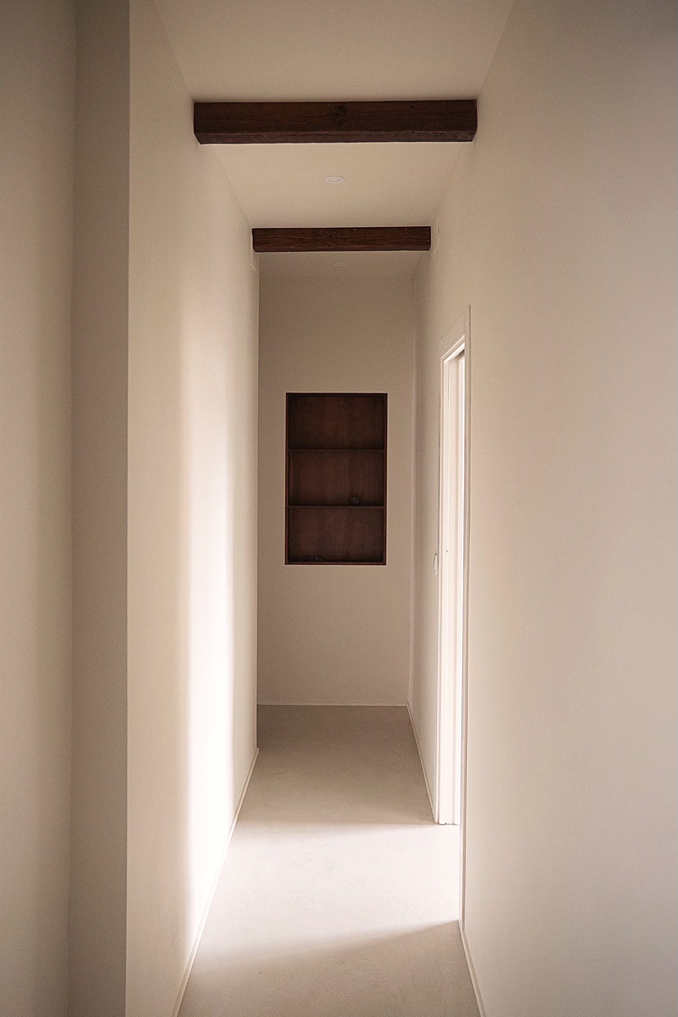
The narrow L-shape was part of the building’s history, a layout from the 1920s when people lived with many small rooms along a long corridor.
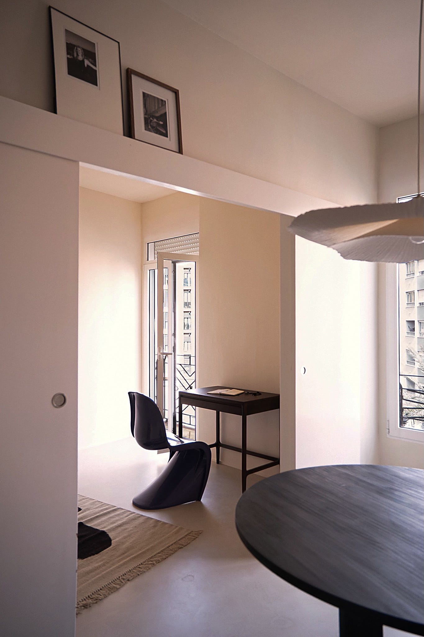
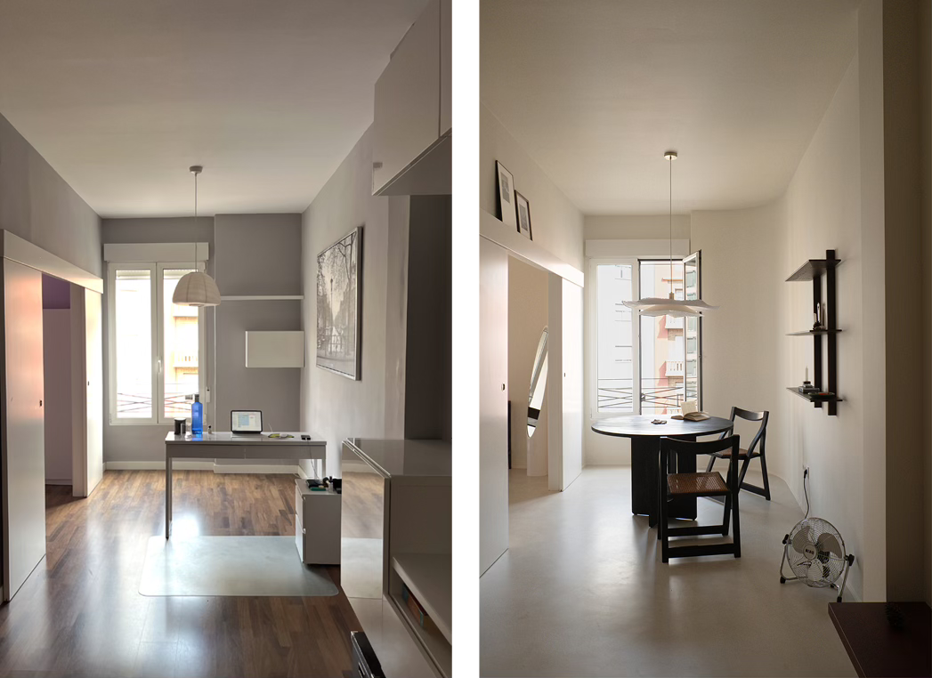
The previous owners had opened it up already to create a living space. I wanted to preserve at least the trace of the original plan. Plus, the corridor created a natural route and clear focal points. We kept it all intact.
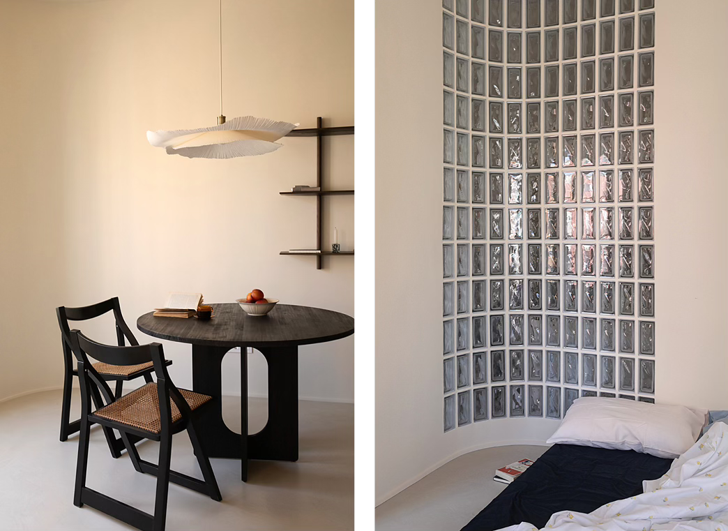
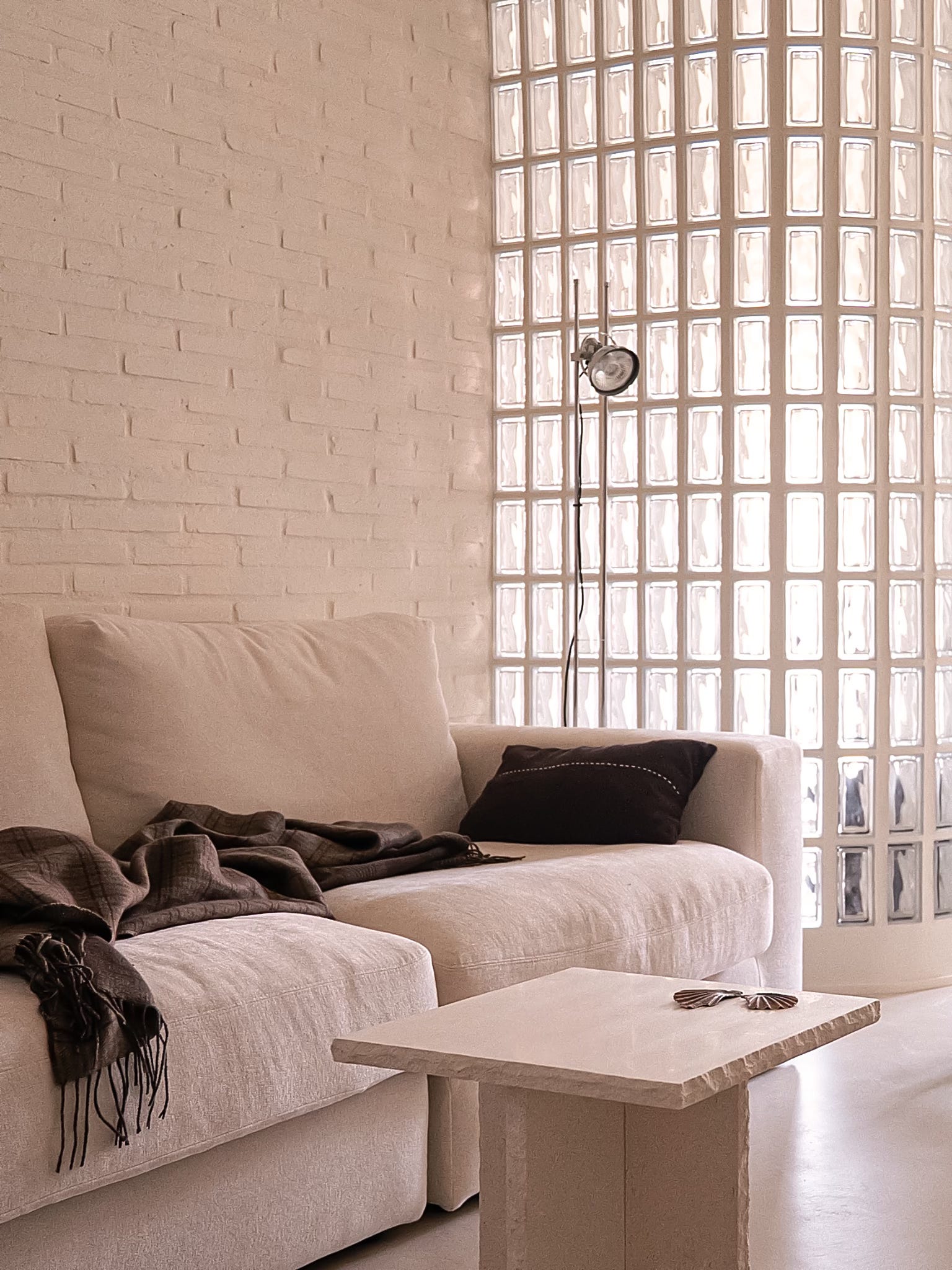
One of the as-found elements impossible to ignore was a curved glass-block wall between the living room and one of the bedrooms. I loved it. But, back then it didn’t have it didn’t have a counterpart. We added another curve to mirror the existing one and make the space feel more intentional. It also helped to soften the corner and “wrap” the already long room rather than ending it abruptly. The room felt calmer and less endless.
What needed to change was not the bones (walls) but the surface, the colours and materials that created visual noise.
Together with my client, we came up with a narrative and brought the palette down to three key elements: walls, floor and joinery.
The Result
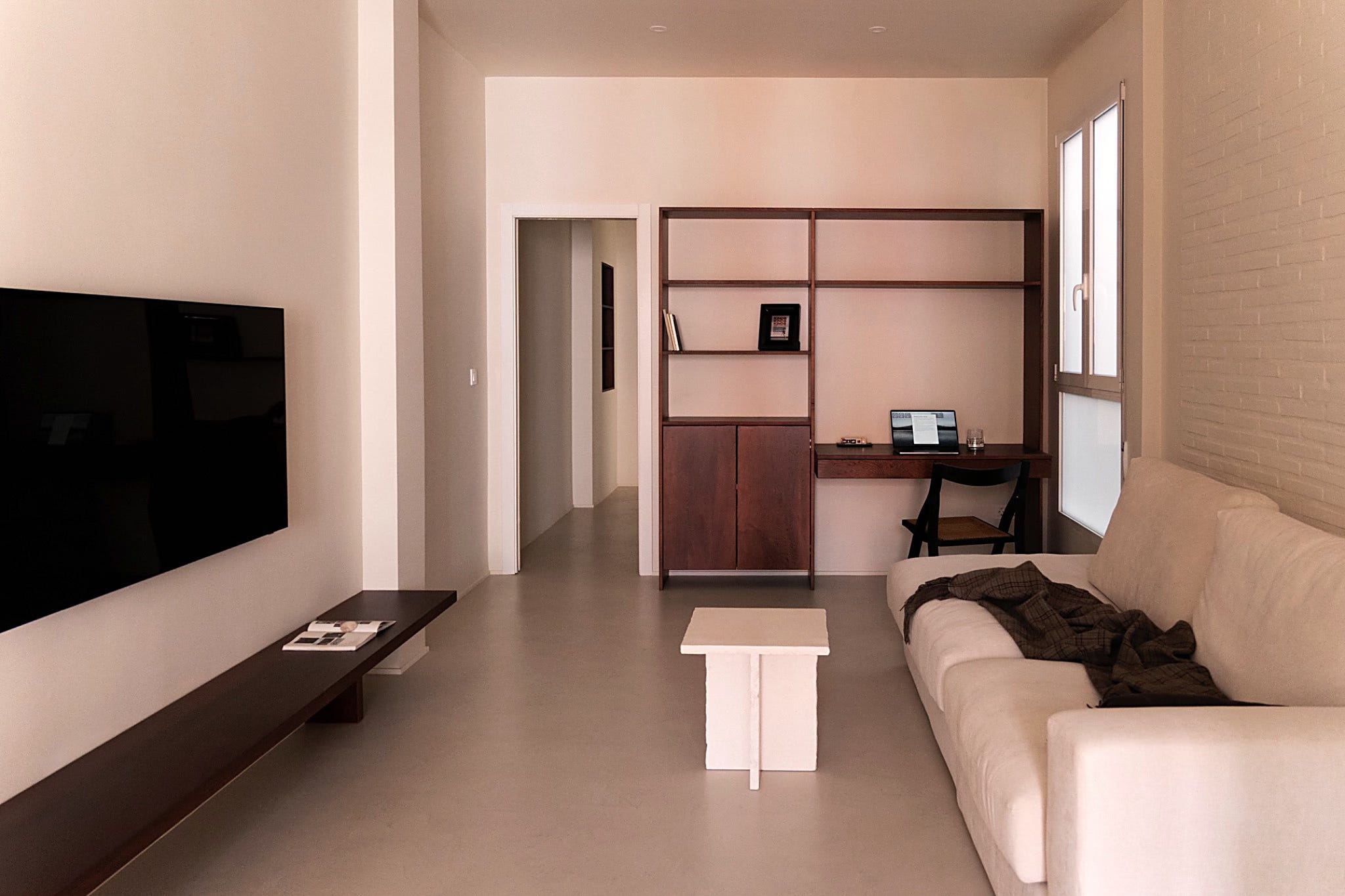
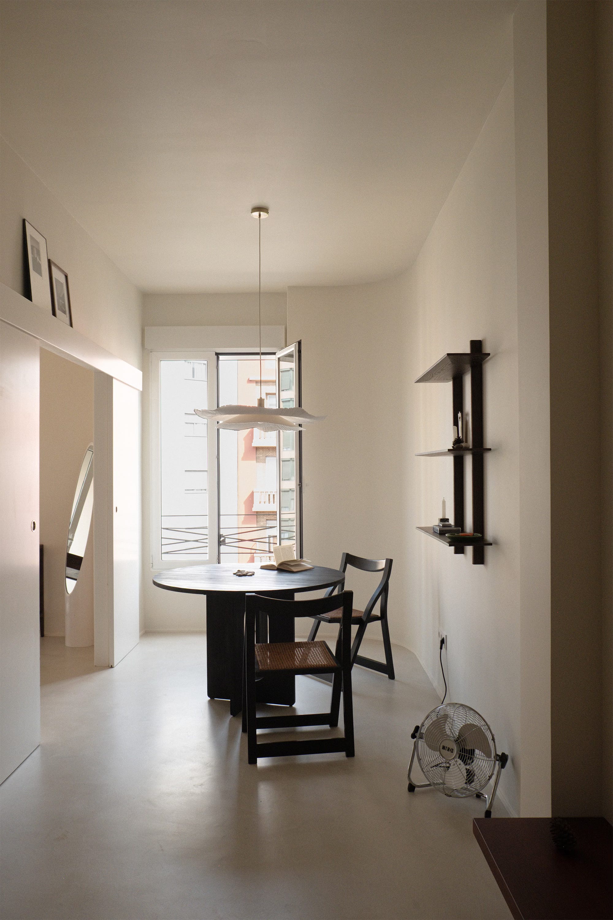
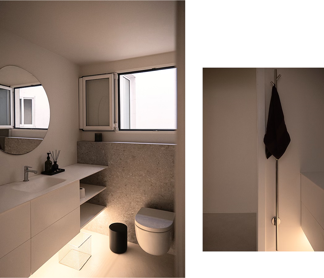
The warm white walls created the kind of quiet the client described at Musée de l’Orangerie and complemented the warmth of Valencia. A background that lets life and light take focus without distraction.
The new microcement floor allowed us to create a uniform surface with no direction or grain. Because the apartment has narrow, awkward corridors, laying tile or wood would have emphasised the linearity. Instead, microcement is visually light and does not attract attention to itself.
The client wanted to walk barefoot at home and have the floors that are easy to clean. Microcement was perfect for that. It is soft to the touch but not glossy, akin to polished stone.
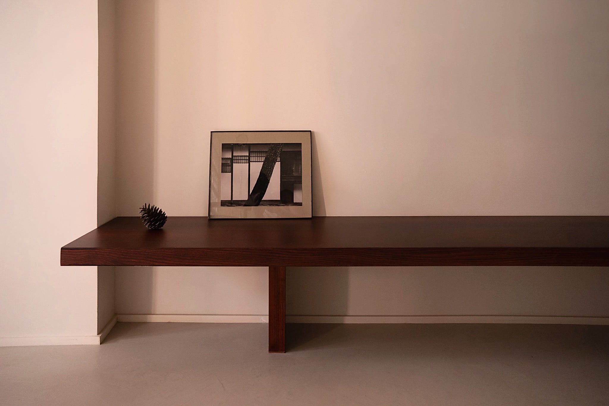
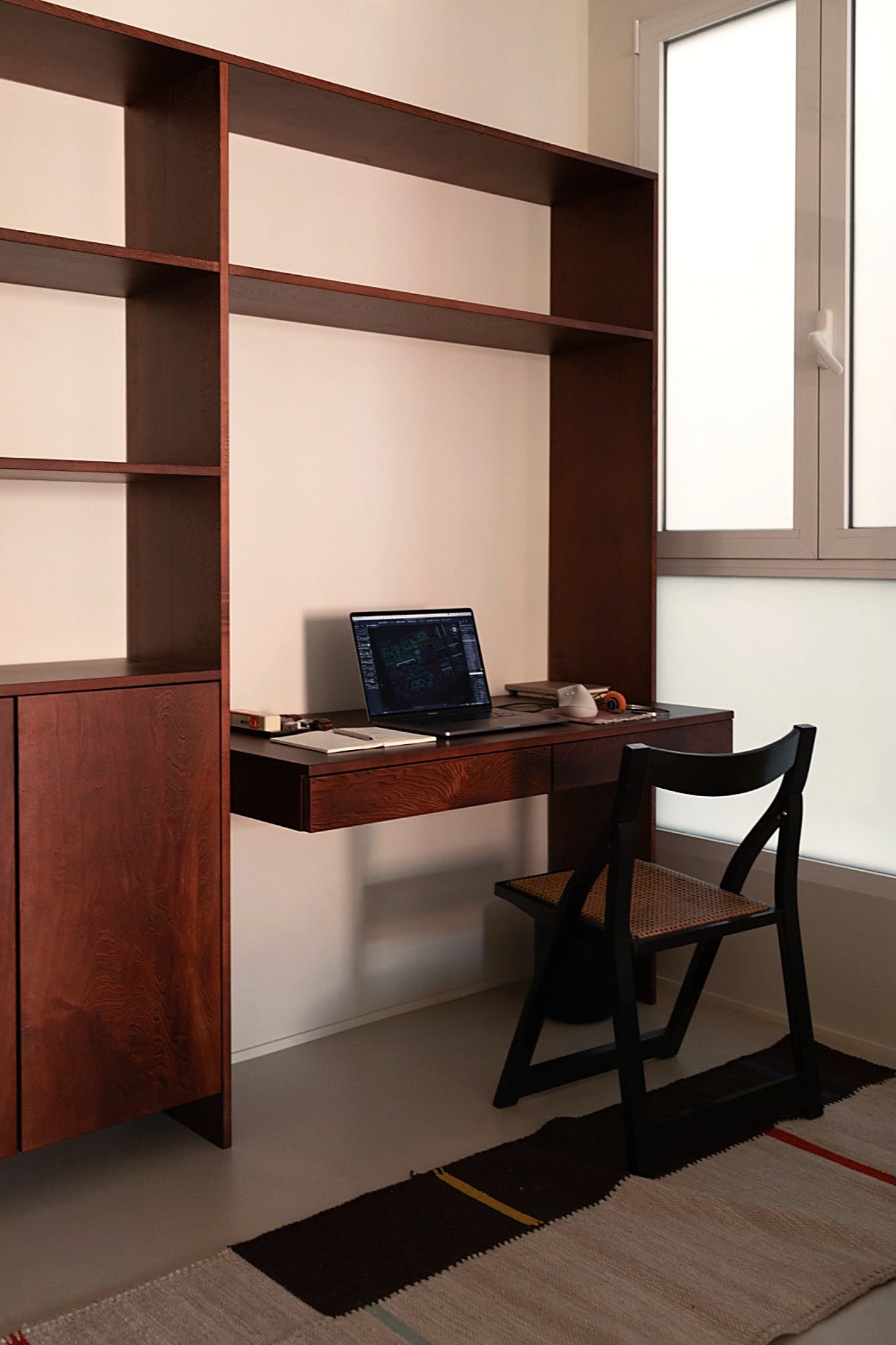
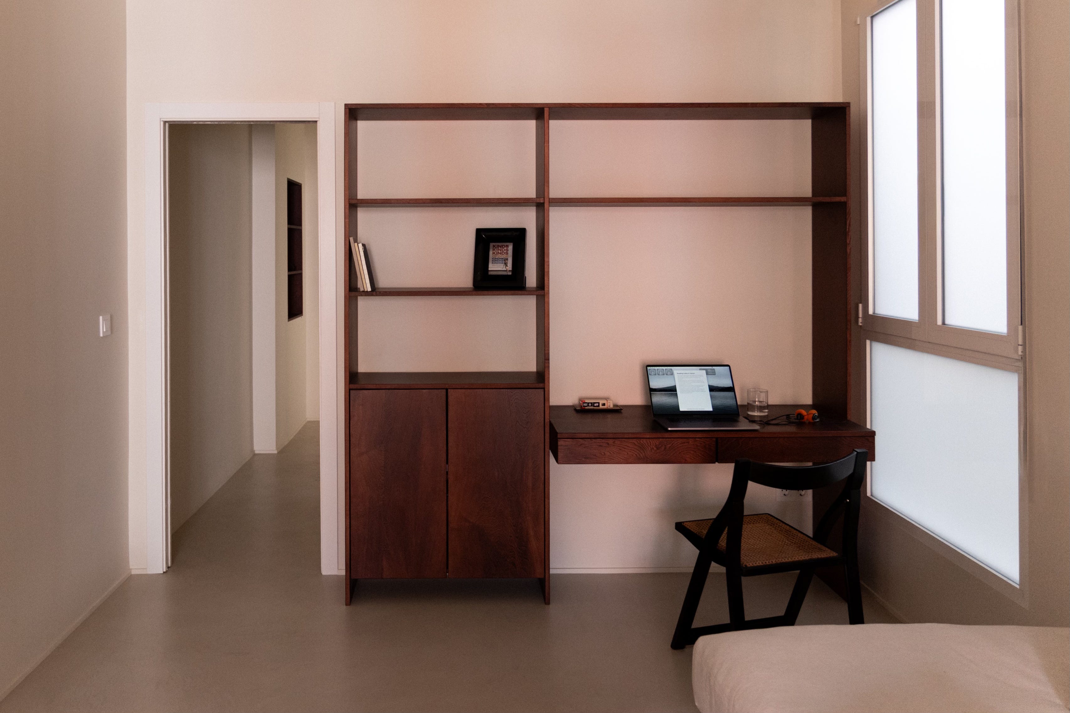
The idea to use red wood came from its traditional use in homes across Eastern Europe. When I mentioned it, the client recalled the cabinets in their parents’ home – wooden wall units, called стеллаж that are full of books, glasses, tableware – things you accumulate through a lifetime.
I wanted to bring that warmth and memory forward but in a simpler form. Shelves in the bedrooms, a shelf in the corridor, a low bench and a bookshelf with a desk in the living room. I placed joinery at the focal points throughout the apartment.
Wood ages with grace, changes colour and accumulates marks. Over time, it will become part of the space in a way paint or plastic never does, bringing warmth that is earned with time.
There was one more nuance.
The living room faces away from the sunset and never gets evening sun. The red wood solved this. When the sun sets on the other side, the joinery reflects whatever light reaches it and the living room takes on a soft pink glow. Not a real sunset, but the feeling of one.
After we finished the project, a friend of mine said it looked like a museum.
I smiled.
Months later, the client told me that working through the design together gave them a way to claim the space before they even understood the city.
A successful project, to me, is exactly that: guiding a client towards something they didn’t think was possible.
This was a small-scope renovation designed to change how the home feels, day to day.
Project Notes:
Location: Valencia, Spain
Type: Apartment renovation
Scope: finishes + bespoke joinery, plan largely retained
My role: Concept design, material palette, joinery design, coordination with contractor and makers
Outcome: Reduced visual noise, calmer circulation, easy-clean continuous floor, warmer atmosphere
Further reading:
Musée de l'Orangerie, Paris / More of my work
About the Author: Polina Morova is an architect and writer based in East London.
If you enjoyed this piece, subscribe to Essential Architecture and share it with someone curious about feeling and understanding buildings.
If you’re thinking about a renovation and don’t know where to start, feel free to email me at morova.polina@gmail.com